UX/UI Design Case Study


•Poor clarity and understanding of what makes products an Eco-friendly choice
•Budget constraints
•Product overwhelm and choice paralysis
Goal
While also making it quick and easy to find the products they need.
Project Duration
Methods & Deliverables
•User Survey
•User Testing
•Personas
•Site Mapping
•Content Design
•Visual Design: Icons, Typography, Photo Editing
Tools
Adobe: Illustrator, Photoshop
Google Forms


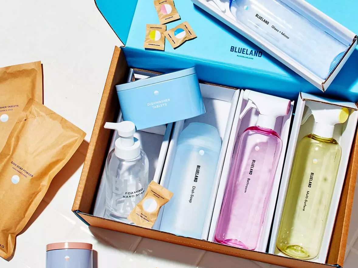
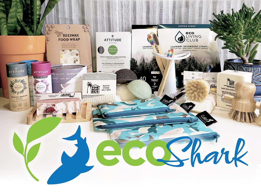
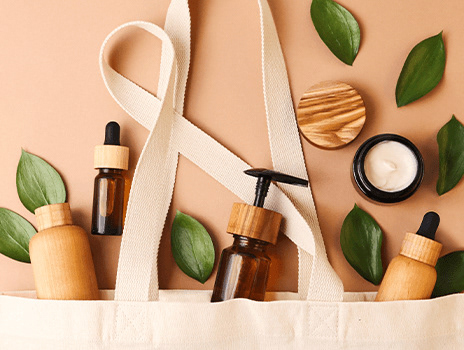
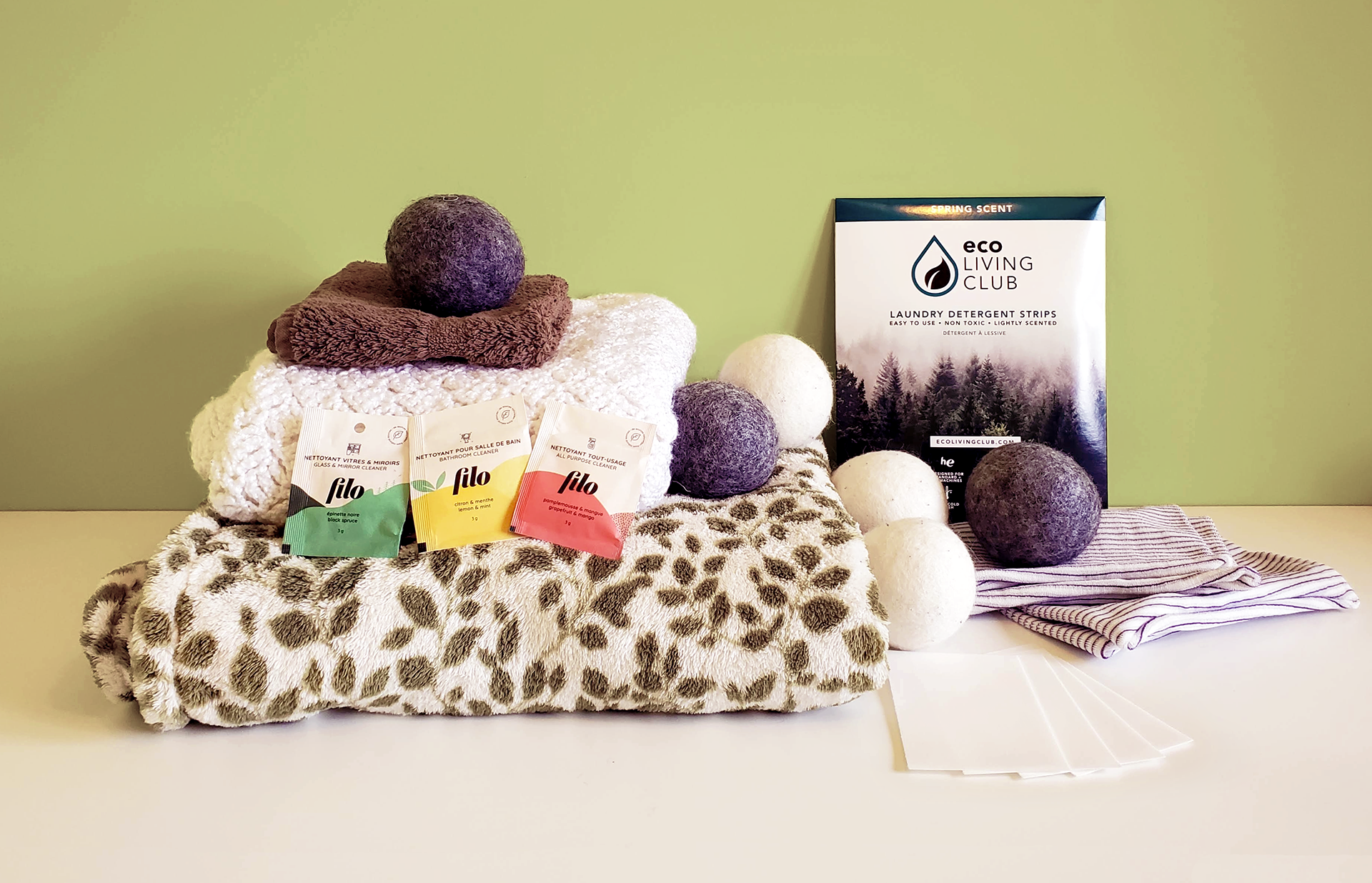
Blueland is a company that produces plastic free cleaning products & accessories for home, laundry, cleaning, & personal care (handsoap). In the form of tablets & powders that are added to water and mixed for use, and tools like reusable product containers, reusable wool dryer balls, and plastic-free, compostable sponges and cleaning cloths.
Differentiation
Major online retailer (subsidiary of Rexall) that sells health, wellness, baby, and beauty products. They do not focus solely on sustainable products, but do have a subsection of “Green & Natural” Products which was the focus of my analysis.
Differentiation


•Cost and effectiveness are the biggest determining factors in product purchases.
•Products being vegan/cruelty free, ethically made, easy to use, & organic are features that many users prioritize.
•Participants with less Eco knowledge don't know what to look for in their products and find many retailers overwhelming or unwelcoming
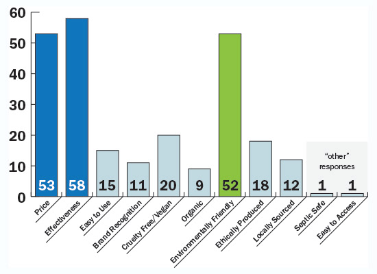
What are your main considerations when purchasing household and/or personal care products?
(select all that apply)
of 67 responses


Expensive and/or ineffective products, a lack of knowledge as to what make a product Eco-friendly, and general overwhelm in an over-saturated market rife with green washing.


Christine
"The Busy Mom"
36/f
Married
3 Children
Notable Quotes:
“I want to be environmentally friendly, but I just wish it wasn't so expensive!”
“Between my job and the kids, I need to just grab something and know it will work.”
Eloise
"The Eco-Conscious Mom"
32/f
Domestic Partnership
1 Child
Notable Quotes:
“I care about the environment, and I need the brands I buy from to care too.”
“I know what I'm looking for in my products, and I know what I'm looking to avoid.”

I developed a user journey for our persona Christine to identify her shopping priorities and how EcoShark can rise to meet them.
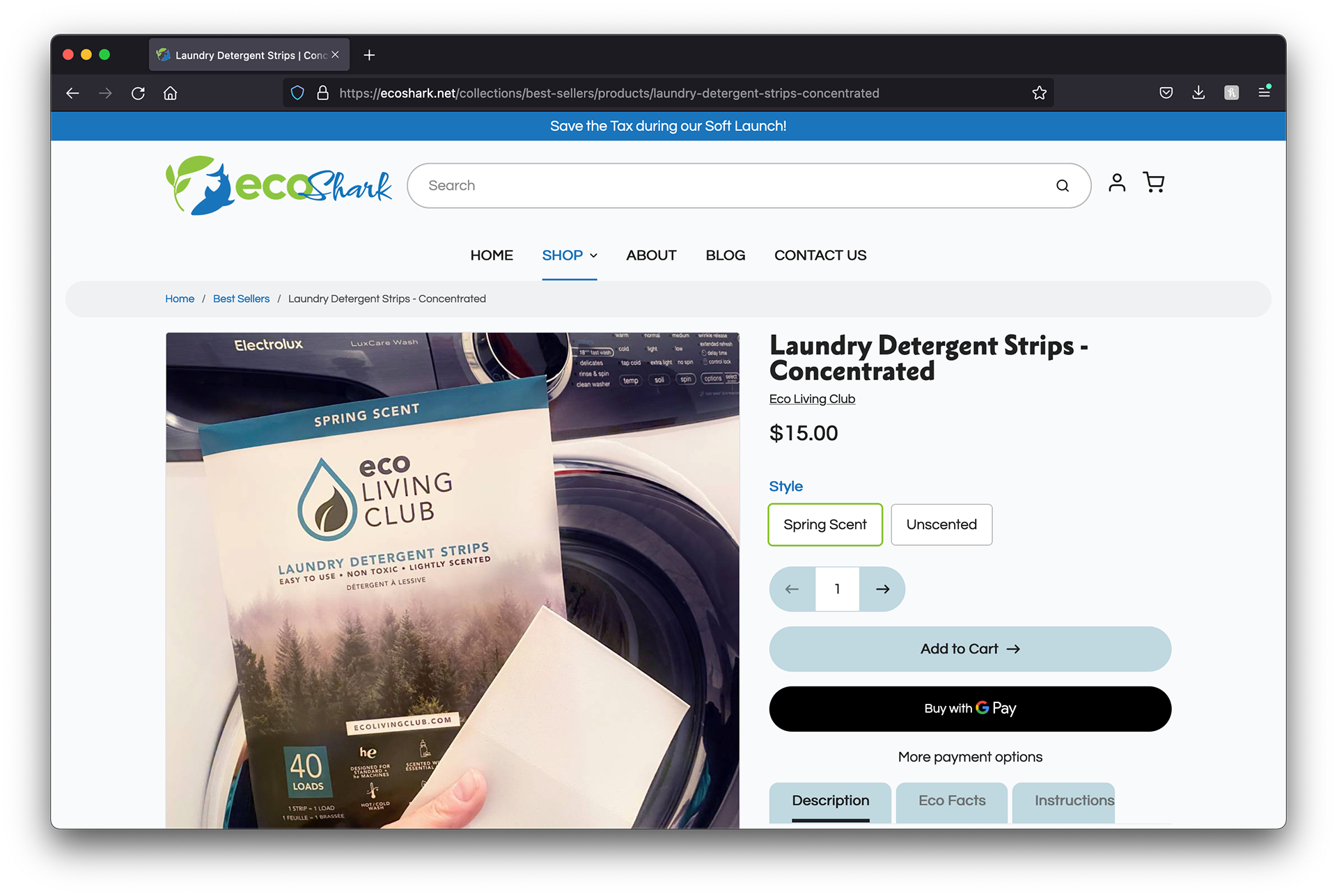
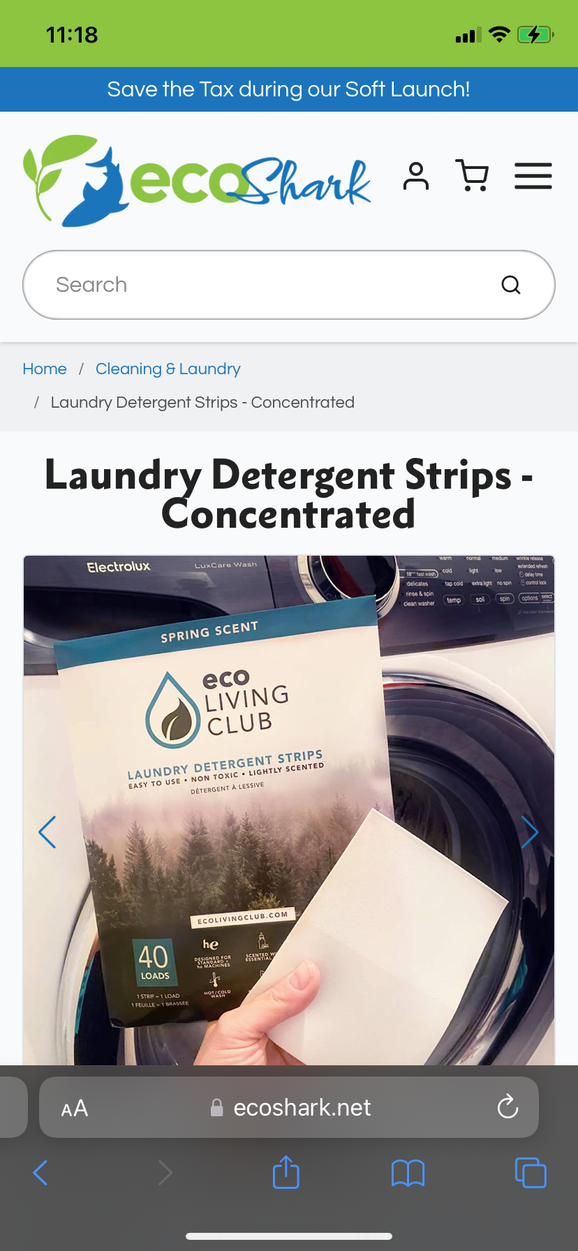
She wants to learn more about the plastic-free kitchen products available, order and receive the products she needs, try the products to test their effectiveness, and feel good about her kitchen routine.
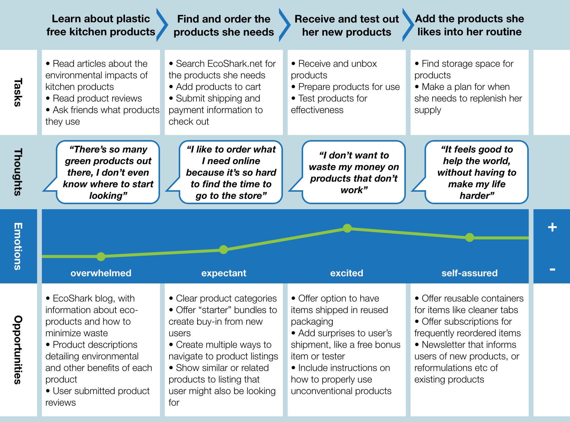


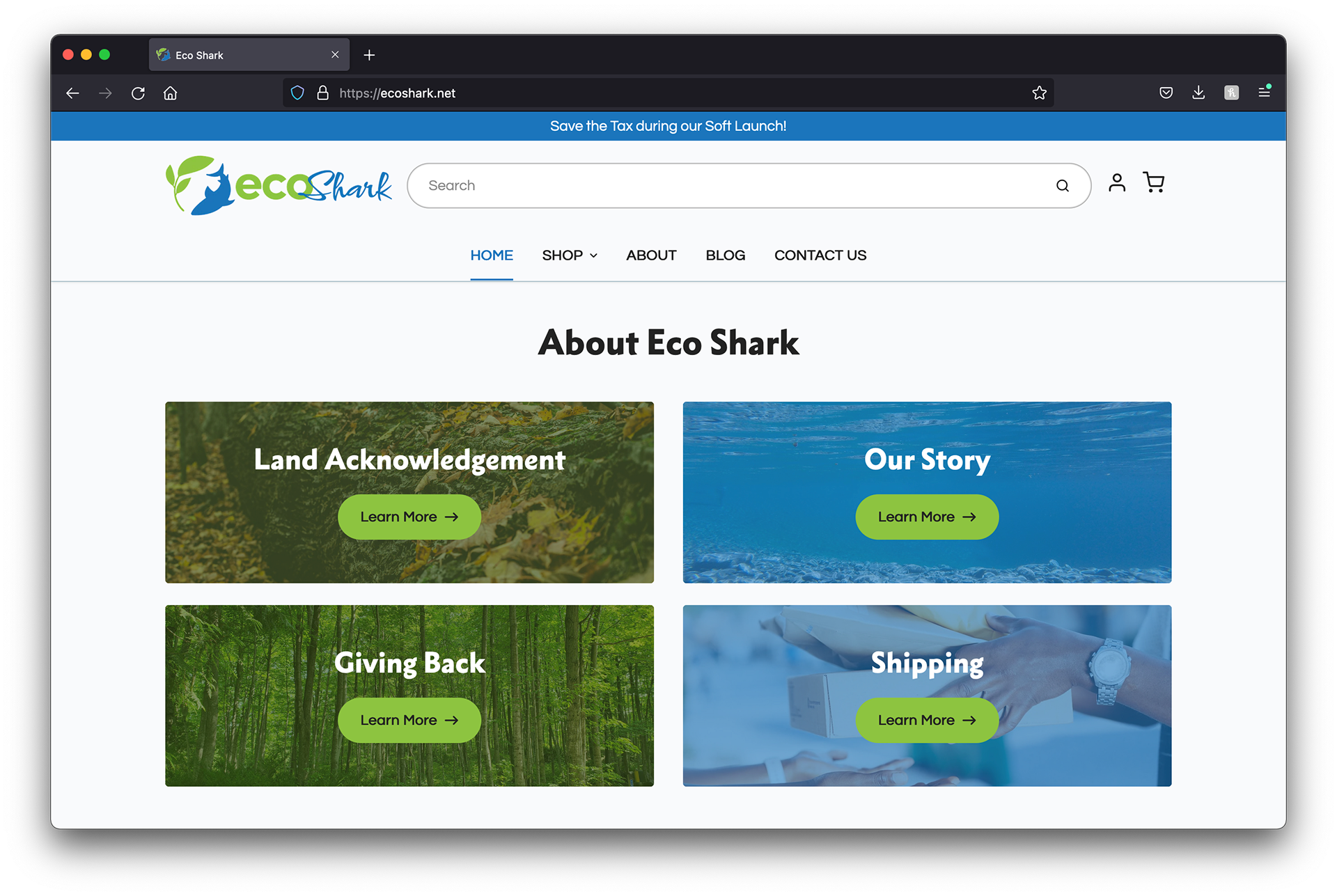
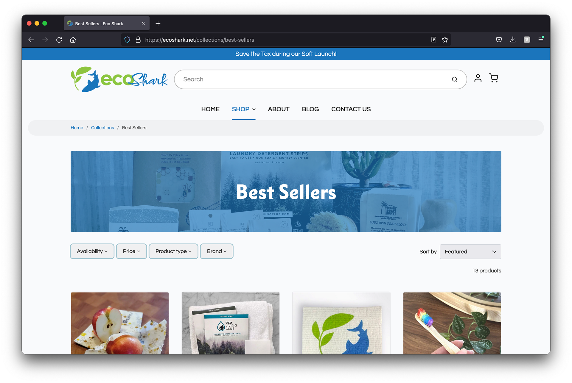
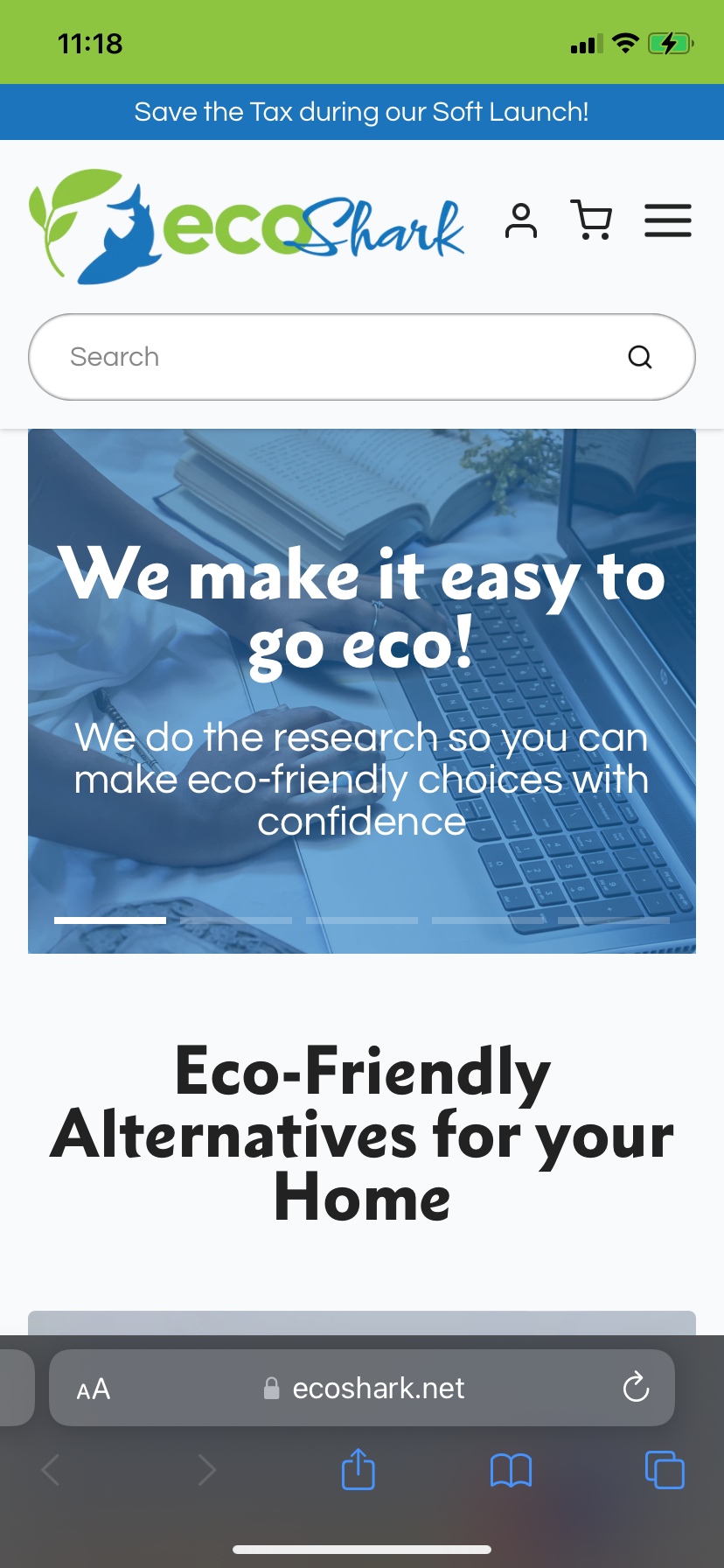
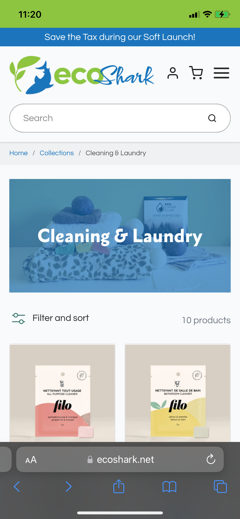
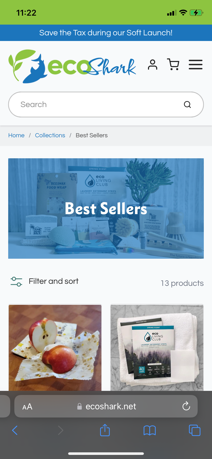
The information and products available on EcoShark needed to be organized in a way that was intuitive while also reducing overwhelm and choice paralysis.
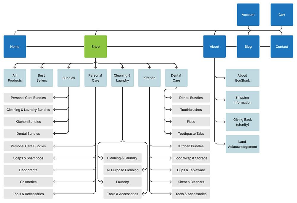
Site Map Option 1
Chosen for site launch
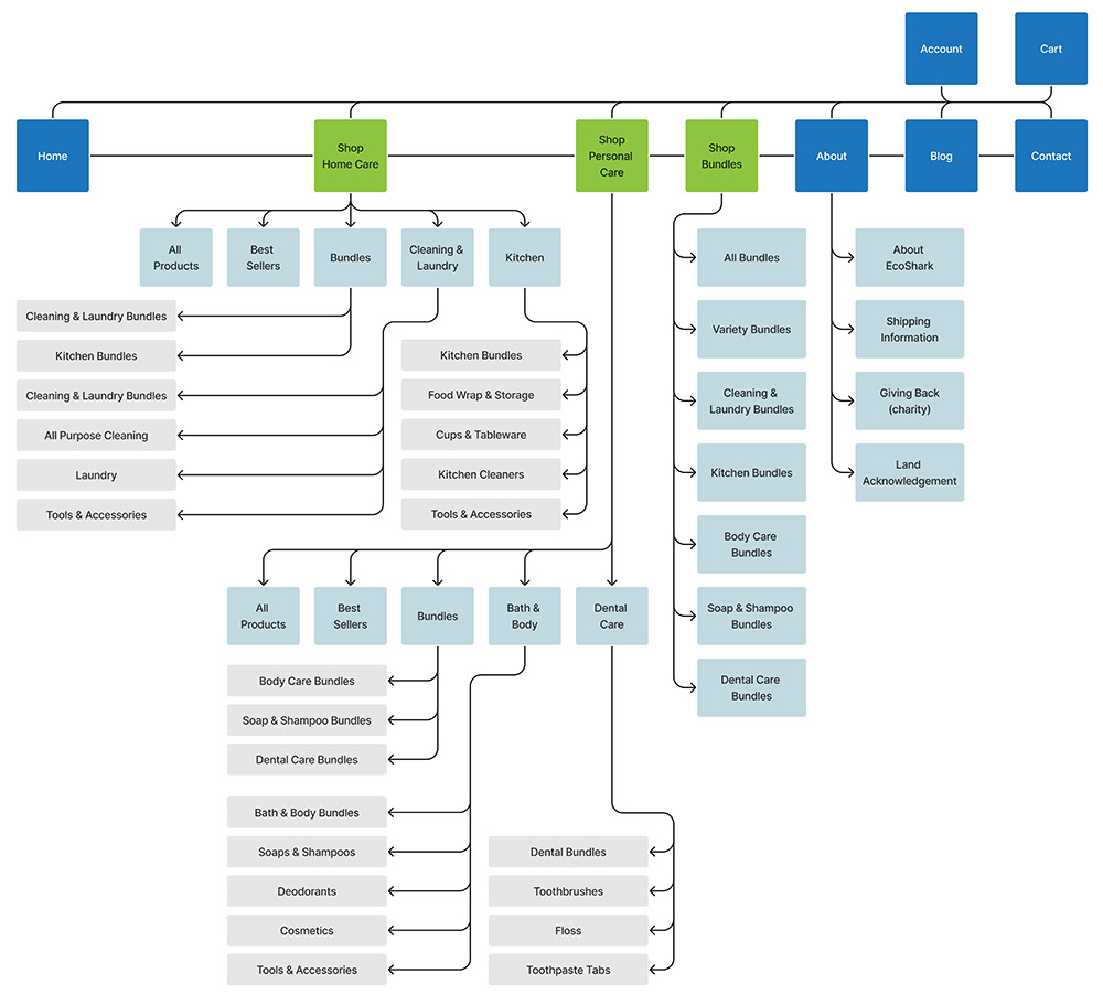
Site Map Option 2
Designed for implementation after initial site growth

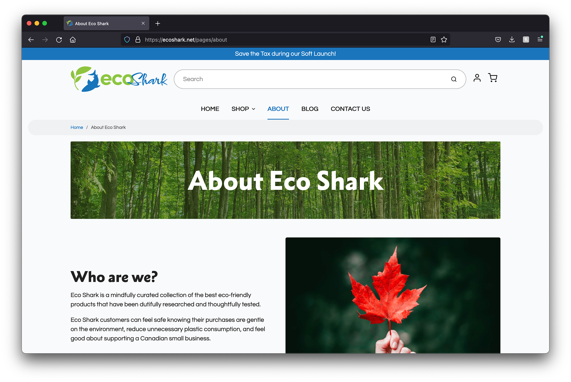
Our goal is to be warm, friendly, and conversational. Arming them with the knowledge they need to make purchasing decisions, without feeling shamed or inferior.


However we did reach out to the developers to unlock further visual customization options. For example, the ability to set the overlay colour on category header images.

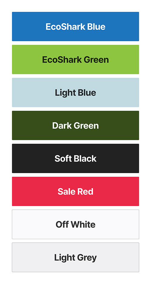
#1C75BC
#8DC440
#C0D8E0
#374D19
#222222
#EA2848
#F9FAFC
#F0F0F1


Metro Nova Extra Black
Headlines
Type Sizes Determined by Shopify Theme
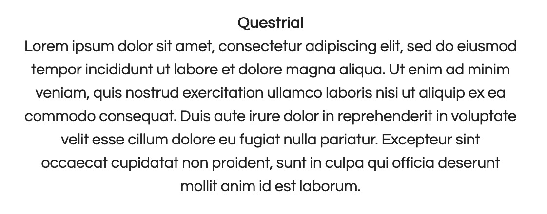
Questrial
All other text and body copy
Type Sizes Determined by Shopify Theme


Full Logo

Logo Circle
Majority of use cases
Used for flavicon & minor placements where visual space is at a premium

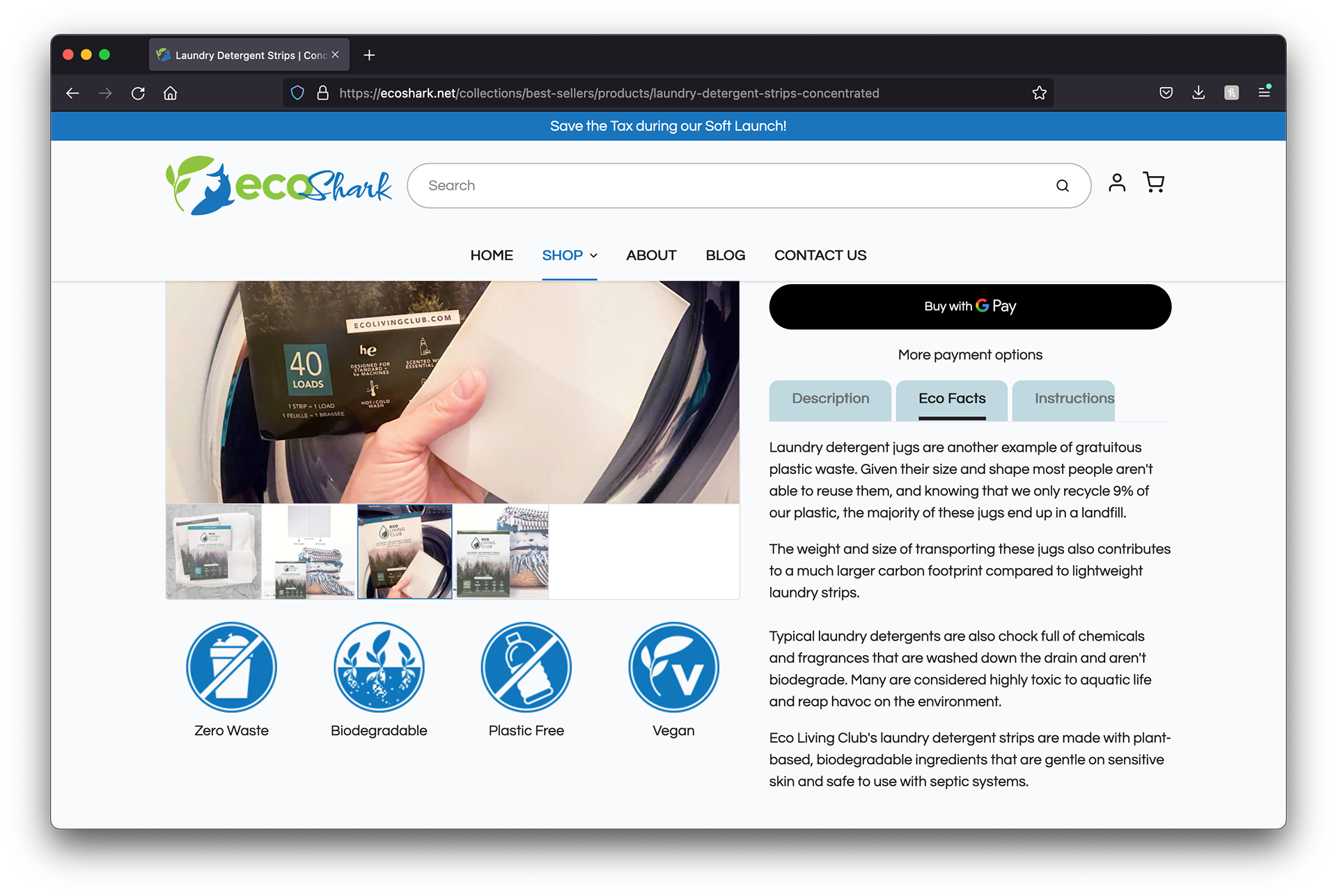
Biodegradable Trust Badge

Compostable

Reusable

Plastic Free

Zero Waste

Made in Canada

Cruelty Free

Vegan

Woman Owned Business

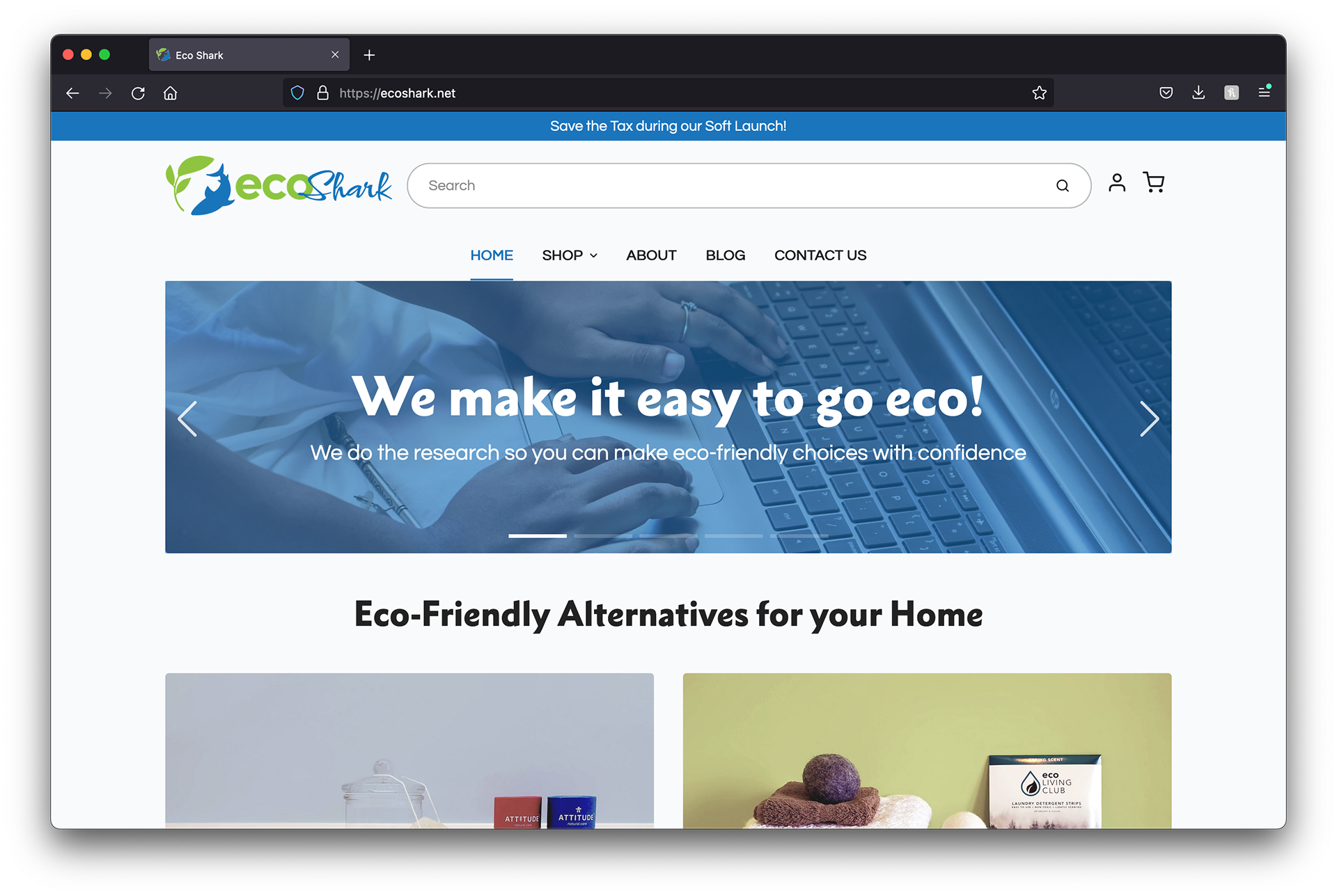
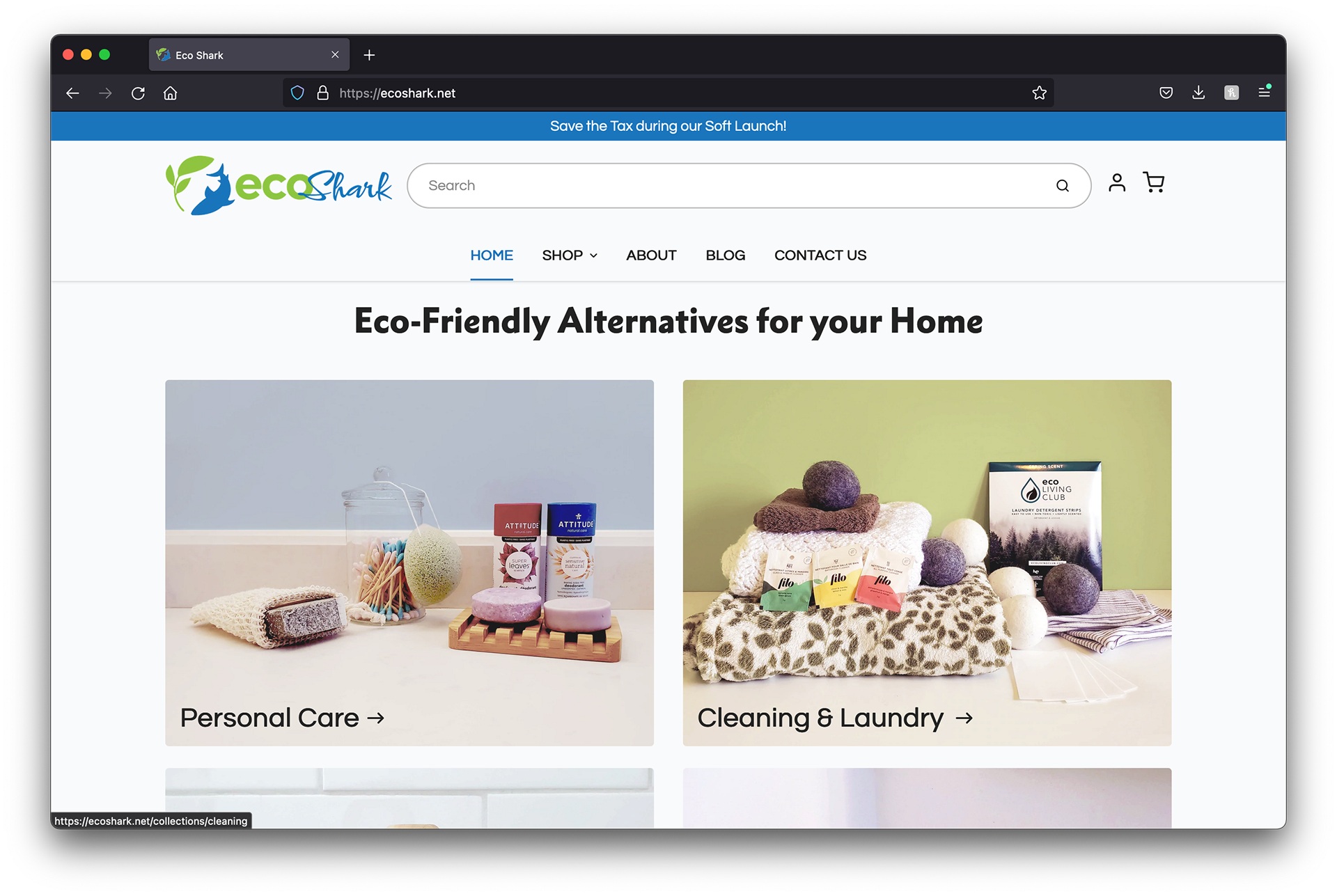
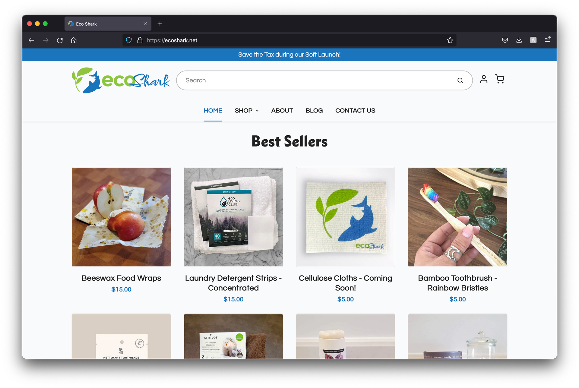
*site has been updated since I completed my work on it


All participants were in their 30s. And featured a mix of genders, races, family, and marital status.
•Adding items to their cart
•Checking out their purchase
•Signing up for EcoShark's newsletter
•Submitting a help request
•Locating different information around the site


Did we meet the challenge?
What would I do differently?
Opportunities for EcoShark
EcoShark could look also look further into having house branded products developed for the site.