HouseKeys
UI Design Case Study
UI Design Case Study
A responsive web app providing buyers with information on properties of interest.
Challenges
Real estate investment is a common way to build financial independence.
However buying real estate can be a complicated process, and many people struggle to crack into this lucrative income stream.
Goal
Goal
Design a responsive web app that provides property buyers with information on properties that are appropriate to their needs and budget.
My Role
My Role
UI Designer
completed as the course project for Career Foundry’s UI for UX designers course.
completed as the course project for Career Foundry’s UI for UX designers course.
Methods
•User Flows
•Wireframing
•Prototyping
•Designing for multiple breakpoints
•Mood Boards
•Style Guide
•Presentation Mockups
Tools
•Wireframing
•Prototyping
•Designing for multiple breakpoints
•Mood Boards
•Style Guide
•Presentation Mockups
Tools
Figma
Adobe: Illustrator, Photoshop
Adobe: Illustrator, Photoshop
Who?
New, small-scale property buyers looking to invest for additional income or financial security.
What?
A user friendly, responsive web app containing a database of available residential properties & land, with comprehensive information on each listing.
When?
Buyers will use this tool when conducting property searches, and making a decision about where to invest.
Where?
Used at home or on the go. Users can search for properties anywhere, as long as they’re logged in on a device.
Why?
Unseasoned buyers need access to reliable, uncomplicated information about their potential property investments before spending time on site.
Primary Persona
Rashida 32f
“I want to provide my family with financial security. I’ve been considering buying property for a while, and am looking for a tool that can help me find what I’m looking for, quickly!”
Who is she?
An IT consultant for a growing tech company, Rashida is frequently on the go, and often holds meetings by phone in her car while driving. She is good at multitasking and relies heavily on technology to help her with this.
Goals
•Wants to invest in property beyond the city for increased financial security.
•Wants to find the right information for fast decision making.
•Wants a tool to help her find the right properties so as not to waste her time.
Tasks
•Search for properties, inputting criteria relevant to what she’s looking for.
•Easily view and return to listings she’s interested in.
•Receive relevant and comprehensive information about properties.
User Flow
Rashida wants to contact real estate agents and/or sellers for properties that she’s interested in, so that she can set up a viewing and potentially put in an offer to buy a home.
Wireframes to High Fidelity
Low Fidelity: Showing basic information placement and establishing visual hierarchy
Mid Fidelity: Further developing visual feel, interactions and fine tuning hierarchy
High Fidelity: Instituting style guide and fleshing out prototype iterations.
Mid Fidelity: Further developing visual feel, interactions and fine tuning hierarchy
High Fidelity: Instituting style guide and fleshing out prototype iterations.
Landing Page
Home Screen
Search Listings
Moodboard & Style Guide
Moodboard
Modern Green
Green is associated with money, growth, and wealth.
Because of this it made sense to capitalize on these associations for a real estate app.
Because of this it made sense to capitalize on these associations for a real estate app.
Additionally drawing inspiration from interior design trends towards organic materials and indoor plants.
A modern aesthetic that is still conservative at its roots.
A modern aesthetic that is still conservative at its roots.
Style Guide
Illustration Style
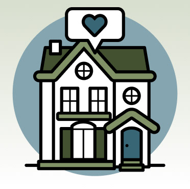
Friendly and approachable, with simple details. Featuring static objects only, no people or motion.


Colour Palette
Primary Palette
HouseKeys Green - Brand Colour
Light Green: header & navigation bars, road colour in maps
Medium Green: logo, accents, active secondary buttons, and other interactive elements
Dark Green: headings, shadows, image tinting, other accents
HouseKeys Blue - Brand Accent
Dark Blue: primary button colour, social Icons, headings, dropdown text rollover colour, other accents
Light Blue: accents in images & maps
Secondary Shades
Grey Shades
Light Grey: inactive buttons, accent colour
Medium Grey: placeholder text, dividers, tertiary text and associated icons, accent colour in images
Dark Grey: Primary text colour, informational icons
Supplementary Colours/Gradients
White: Primary background colour, icon button colour, accents
Black: Outline colour in illustrations, text that accompanies illustrations
Light Green Gradient: Special Backgrounds; always a vertically linear gradient, with light green on top to white at bottom.
Type Styles
Logos & Icons
HouseKeys Logos
Main Navigation Icons
Secondary Icons
Property Type & Room Icons

Ammenity Icons
UI Elements

Primary Buttons
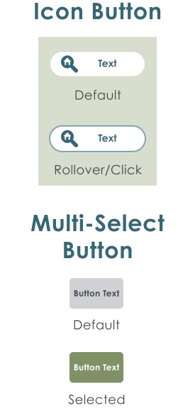
Secondary Buttons

Selection Interfaces
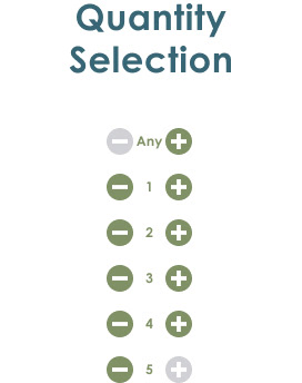
Quantity Selection
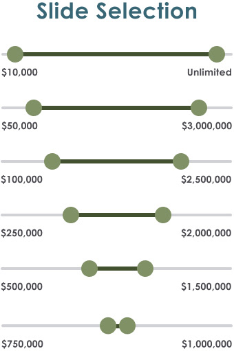
Range Slide Selection
Search Animation
Responsive Design
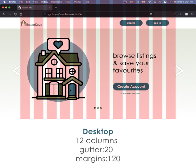
Responsive Grids
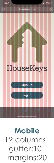
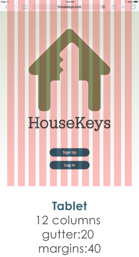
12 column grid for compliance with major programming standards, and smooth transitions between screen sizes, while prioritizing mobile-first design. Desktop size also allows for more information to be displayed on a single screen.
12 column grid for compliance with major programming standards, and smooth transitions between screen sizes, while prioritizing mobile-first design. Desktop size also allows for more information to be displayed on a single screen.
High Fidelity Screens & Interactive Prototype
High Fidelity Mobile Screens
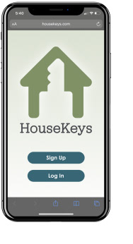
Splash Screen
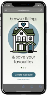
Onboarding
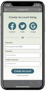
Create Account Screen
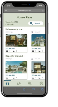
Home Screen

Search Screen

Property Details Screen
High Fidelity Tablet Screens
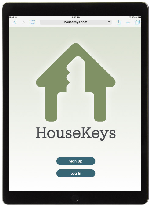
Splash Screen
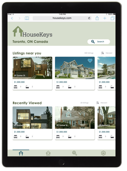
Home Screen
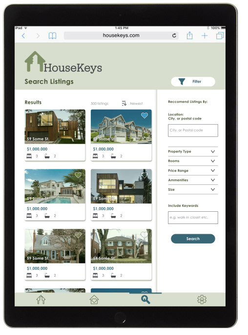
Search Listings
High Fidelity Desktop Screens
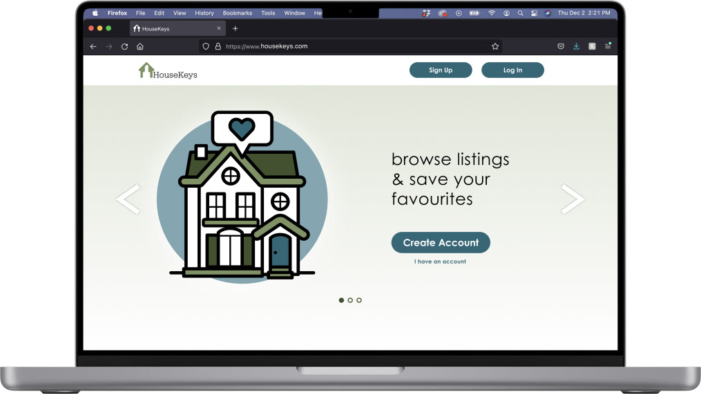
Splash Screen
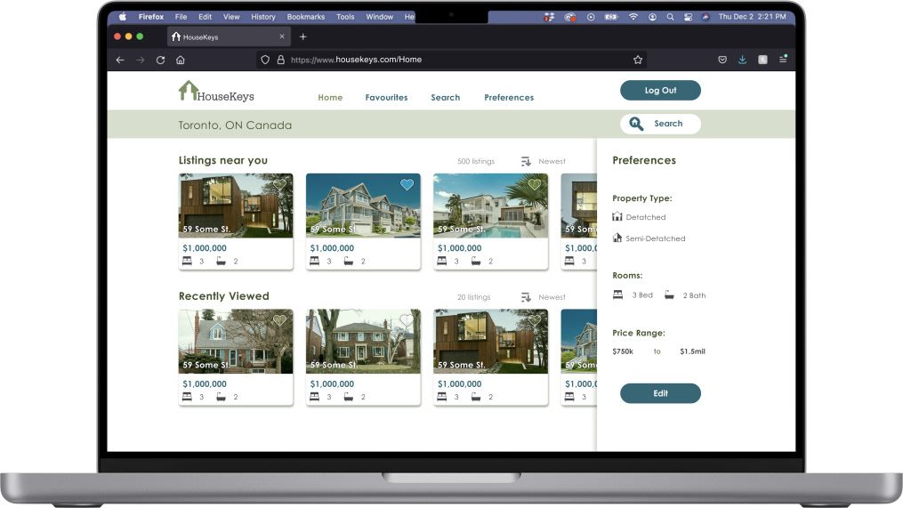
Home Screen
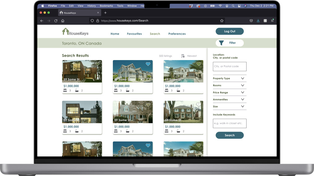
Search Listings
Interactive Figma Prototype
Summary
Did we meet the brief?
HouseKeys is a simple web-app that will make it easier to connect new buyers with the agents & sellers of the properties that they want to buy.
What would I do differently?
I would want to have more involvement at the research stage, & would liked to have had more opportunities to test my prototype and design decisions with potential users over the course of the project.
Opportunities
HouseKeys could also have a separate mode for users who are renters. The rental market in Canada is just as hot as the real estate market, and it can be very challenging for renters to find homes that meet their needs in their price range.
Thanks for viewing
HouseKeys
